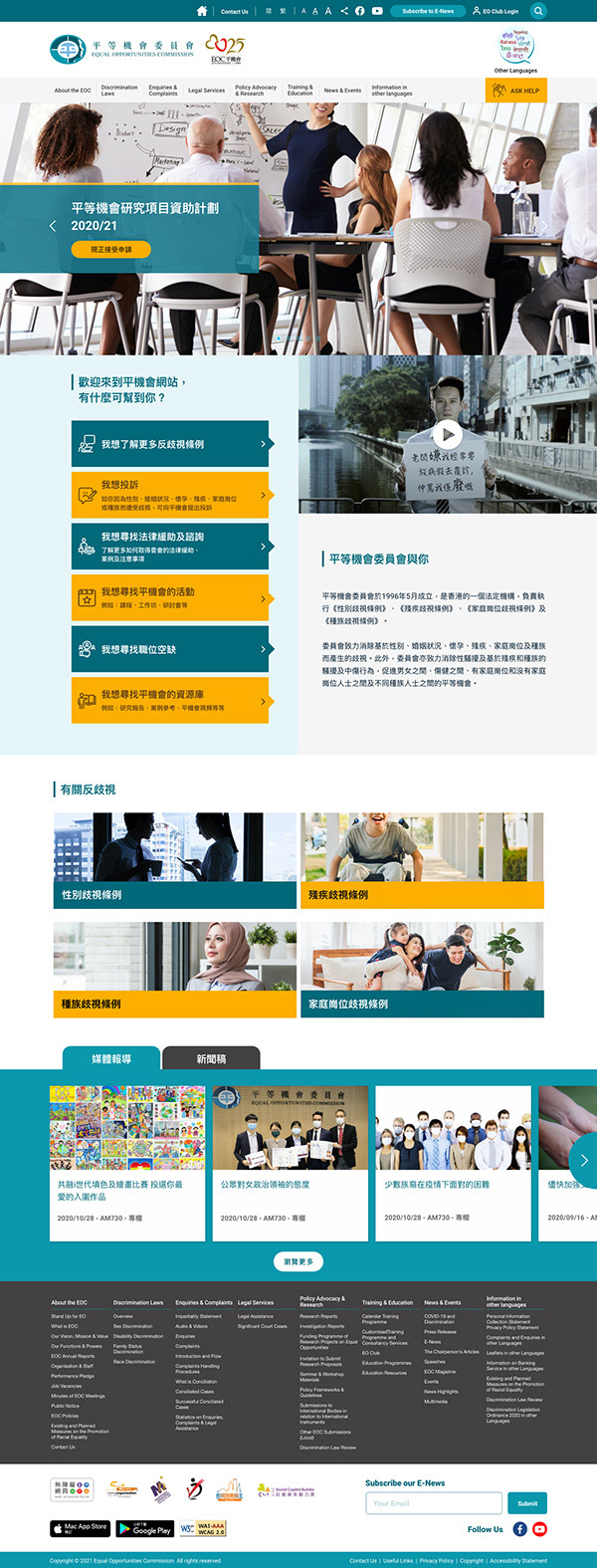
The Equal Opportunities Commission (EOC) of Hong Kong is a statutory body committed to promoting equality and eliminating discrimination. I was part of the creative team tasked with revamping their website to better reflect their core values of inclusion, dignity, and accessibility through refreshed design, clear communication, and improved usability for all users.
This project balanced brand evolution with functional upgrades, ensuring the new platform aligned with both the EOC’s legal mission and the everyday needs of diverse users—including those with disabilities.
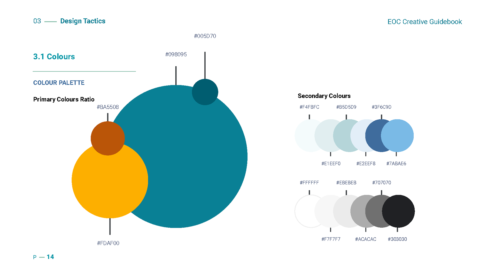
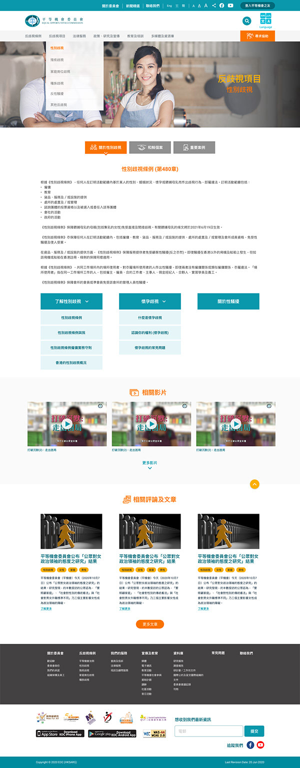
Visual Language & Brand Refinement
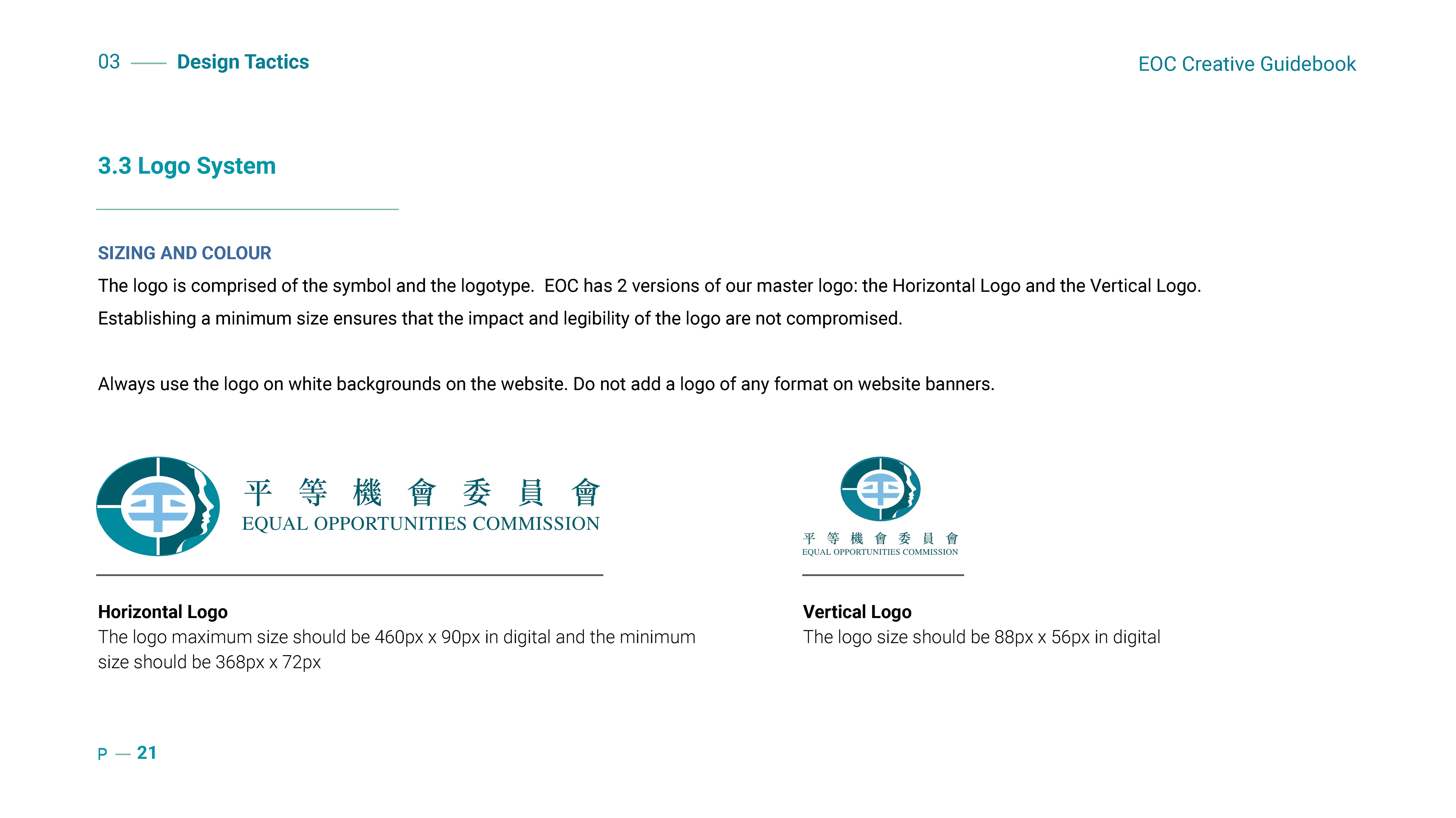
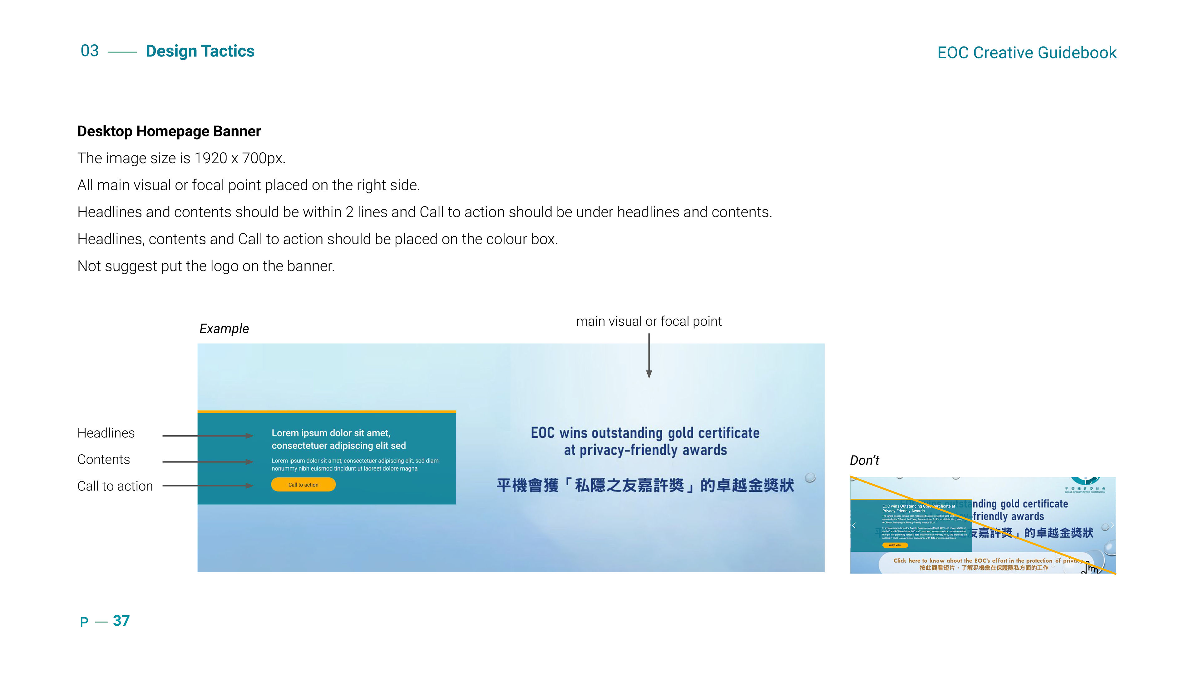
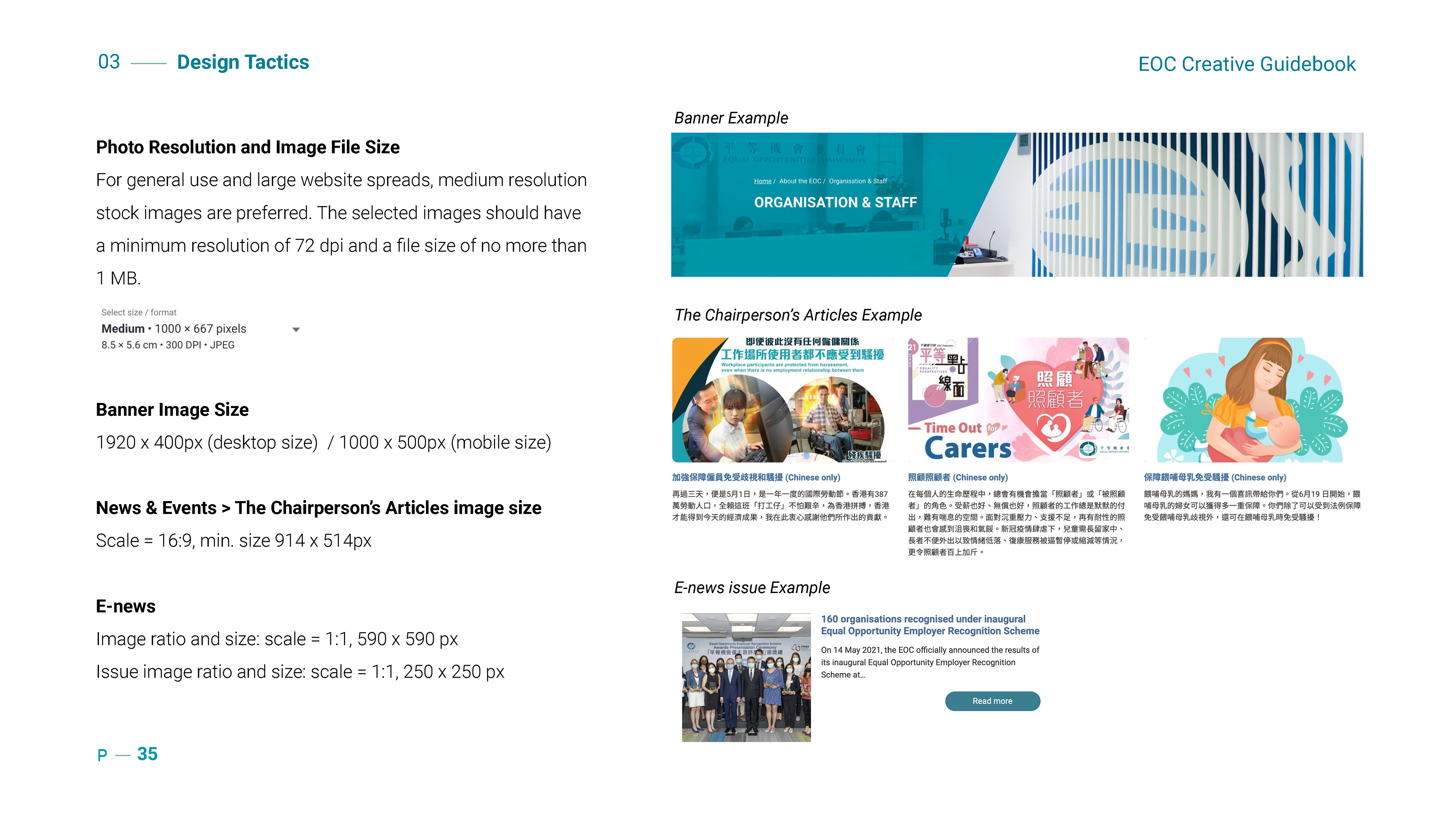
Reimagined the visual identity for digital, incorporating a more inclusive color palette, welcoming tone of voice, and updated imagery style guidelines that reflect real people and real communities.
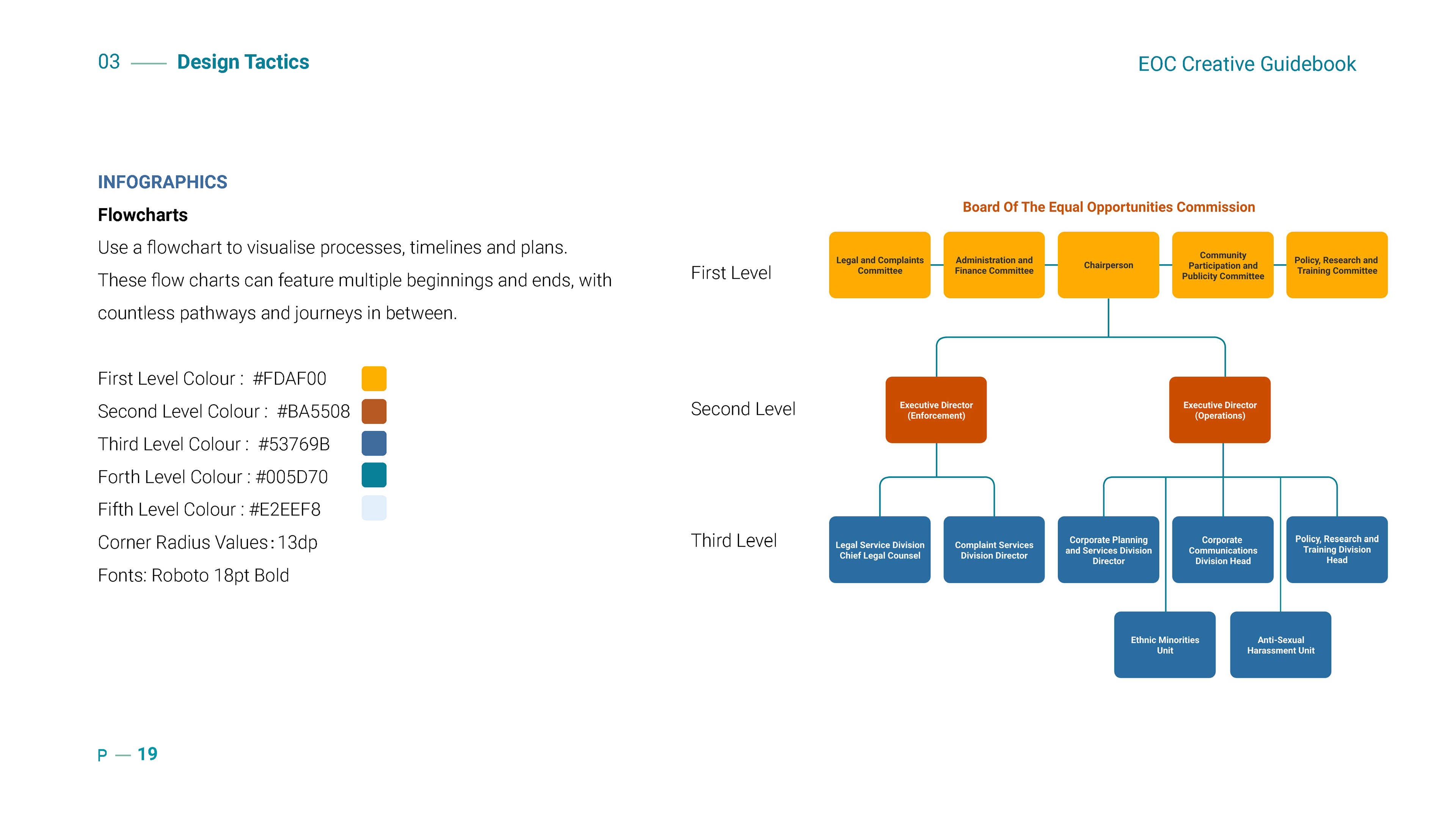
Created a consistent design system to support brand clarity across content-heavy layouts, charts, and infographics.
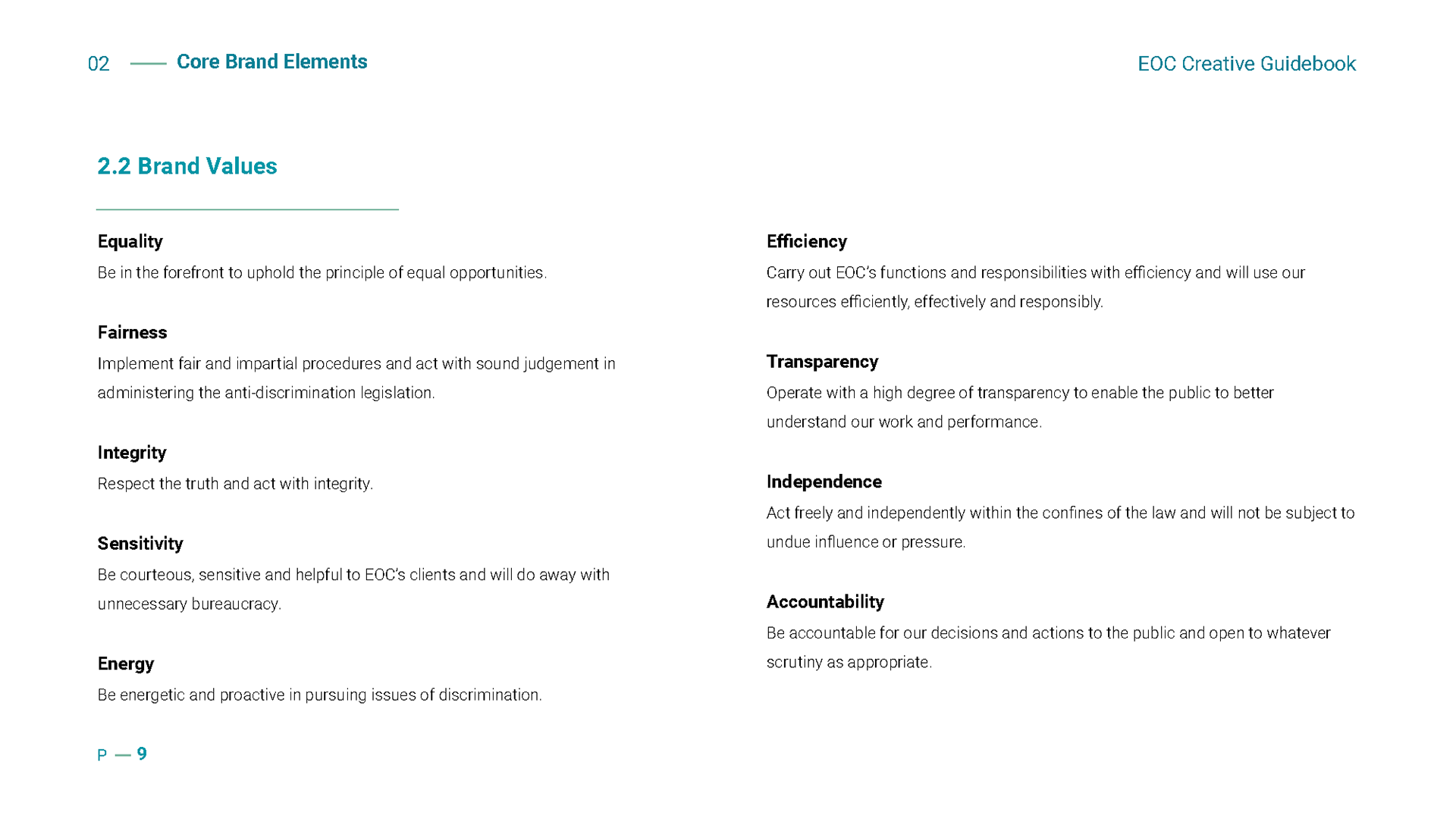
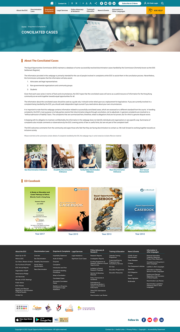
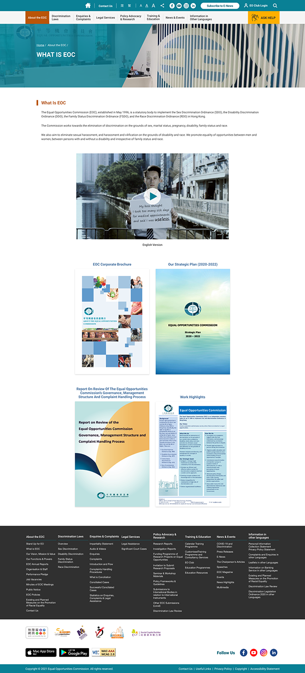
Accessibility & User Experience
Integrated disability-friendly features such as font resizing, contrast toggles, and screen reader compatibility, following WCAG accessibility standards.
Designed a clear, modular layout structure to improve readability and simplify complex information for diverse user groups.
Content System & Visual Communication
Developed visual chart guides and layout templates to make legal and educational content easier to digest.
Ensured consistency in page structure and styling, helping users navigate efficiently across both mobile and desktop.
My Role:
Visual Design Lead · Accessibility Design Support · UX/UI System Creation · Brand Tone and Imagery Refresh
Tools Used: Figma · Illustrator · Accessibility Guidelines (WCAG)
Tools Used: Figma · Illustrator · Accessibility Guidelines (WCAG)